top of page

SOCIAL IMPACT
RESEARCH
INFOGRAPHICS
APP DEVELOPMENT
GRAPHIC DESIGN
BRANDING
3D RENDERING
LENS CO
GRAPHIC DESIGN
INFOGRAPHICS
SLIDE DECKS
RESEARCH &
ANALYSIS

SAFE PLACE
FOR YOUTH
ANALYSIS
This slide deck was created for a homeless youth organization with the goal of simplifying complex data into an easily digestible format. I carefully selected the brand's colors as the palette and designed each slide with precision. The graphics were crafted to not only stand out but also effectively convey the message of each slide.


1/1

YOUNG PEOPLE TO THE FRONT
This graphic was made based on a specific color palette and a predetermined style. They wanted something that represented Los Angeles.
Originally it was designed to be printed on tote bags to sell as a way to raise money. It has since become the rebrand for Lens Collective and serves as the main logo.

Bringing Resources, Information & Necessities to Students with Knowledge
BRINK
BRINK is a mobile student outreach system that brings resources to students in need.
The Mobile Market, Student Services Van & Hygiene Trailer are fully equipped to provide services to students in the selected areas which are crucial to their wellbeing.
Our mission is to bridge the gap between students and services, so that they are available both on and off campus.
RESEARCH & ANALYSIS


1/1
PROBLEM
Researching current California State University students who have/had experienced homelessness and food insecurity.
COVID made accessing help even more difficult for students, as most campuses were closed.
Majority of students facing these issues have not or do not seek assistance and many campuses do not offer assistance programs.
GOAL
Come up with a solution to fill in the disconnect between the system and the students. Many are unsure of how to access these programs. Let's find a way to fix that.
LOGO VARIATIONS
LongHaul Modified is the main logo font. It is often used with a colored drop shadow. The lines represent the disconnects in our systems and how easily one can fall through the cracks, but together we can eliminate those gaps and get relief to students who need it.
BRAND COLORS
Blue is color of security and trust, orange represents information and help. Green is for health and nutrition. Together these colors represent all the areas BRINK has to offer.


BRANDING
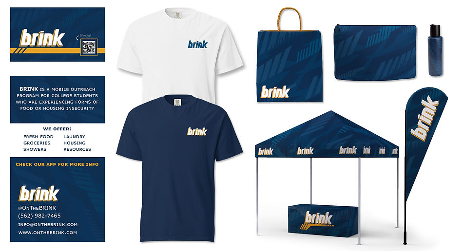
GEAR
-
Business cards that include the QR code to the mobile app and a list of services
-
Worker shirts are in navy, volunteer shirts are in white
-
BRINK branded bags and hygiene kits
-
BRINK pop up booth for on-site events


1/1
VEHICLES
MOBILE MARKET
HYGIENE TRAILER
STUDENT SERVICES
-
Fresh produce
-
Nonperishable items
-
Healthier options than gas station
-
Eco-friendly bags & utensils
-
Shower stalls
-
Laundry area
-
Free hygiene items
-
On Site case worker
-
Tablets for filling out applications
-
Pocket guides & informational handouts
-
Print & scan documents needed for assistance applications

BRINK MOBILE APP
The BRINK Mobile App is designed to help students use our services off campus. The vehicles travel around the greater LA area stopping at certain locations throughout the week. Students can select a service and a time slot so they don't have to wait in line. The app also offers information about On and Off Campus resources.
Below is an active QR code that leads to the BRINK app.


bottom of page